| Learning Outcomes |
| · Situations or issues that can be dealt with through statistical methods are identified correctly.
· Appropriate methods for collecting, recording, and organizing (data are used to maximize efficiency and ensure the resolution of a problem or issue · Data sources and databases are selected in a manner that ensures the representativeness of the sample and the validity of resolutions. · Activities that could result in the contamination of data are identified and explanations are provided of the effects of contaminated data. · Data is gathered using methods appropriate to the data type and purpose for gathering the data. · Data collection methods are used correctly. · Calculations and the use of statistics are correct. · Graphical representations and numerical summaries are consistent with the data and are clear and appropriate to the situation and target audience. · Resolutions for the situation or issue are supported by the data and are validated in terms of the context |
Interpreting and analyzing data are problem-solving processes essential for dealing with the information presented in many different forms, including but not limited to graphs and tables. Visual displays of data are found in reports and the media, often being used to make decisions or to determine whether to support or reject arguments.
A Problem-Solving Process
The word statistics may bring to mind polls and surveys, or facts and figures in a newspaper article. But statistics is more than just a bunch of numbers: Statistics is a problem-solving process that seeks answers to questions through data.
By asking and answering statistical questions, we can learn more about the world around us. Statistics is used every day to help us gain insight into questions that affect our lives: Is our population growing or shrinking? What is the safest way to invest money? Will eating more fruits and vegetables make us live longer?
What do you think of when you hear the word statistics?
Four things make a problem statistical: how you ask the question, the role and nature of the data, the particular ways in which you examine the data, and the types of interpretations you make from the investigation. A statistics problem typically contains four components:
Asking a question gets the process started. It’s important to ask a question carefully, with an understanding of the data you will use to find your answer. The question is most frequently derived from a problem situation and therefore can be seen as the core focus for the modeling of the data.
Collecting data to help answer the question is an important step in the process. You obtain data by measuring something, gathering relevant information about blew the situation, or even through sampling which I, another collect data. Experimentation is another.
Data must be organized, summarized, and represented properly to provide good answers to statistical questions. Also, the data you collect usually vary (i.e., they are not all the same), and you will need to account for the sources of this variation. The integrity of the source is of utmost importance to ensure an accurate analysis.
After you analyze your data, you must interpret it to provide an answer — or answers — to the original question or problem situation.
You will become increasingly familiar with this process as you investigate different statistical problems.
From the recognition of trends to extracting patterns and extrapolating from data are higher-order problem-solving components of data interpretation and analysis. Therefore, before we can start to analyze data we need to understand how to collect the information, organize it effectively, and then present it in an easy-to-understand format.
Many forms of models could be used to present and display information for analysis. Selecting the correct one could be critical to ensure that the application information can be analyzed effectively.
Let’s have a look at a few of these examples. As you go through the examples with your facilitator, discuss other possible applications for the use of the models.
Line Graphs
A line graph is a way to summarize how two pieces of information are related and how they vary depending on one another. The numbers along a side of the line graph are called the scale.
Example 1: 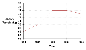
Description: The graph above shows how John’s weight varied from the beginning of 1991 to the beginning of 1995. The weight scale runs vertically, while the time scale is on the horizontal axis. Following the gridlines up from the beginning of the years, we see that John’s weight was 68 kg in 1991, 70 kg in 1992, 74 kg in 1993, 74 kg in 1994, and 73 kg in 1995. Examining the graph also tells us that John’s weight increased between 1991 and 1995, stayed the same during 1991, and fell during 1994.
| Use: |
|
|
Pie Charts
A pie chart is a circle graph divided into pieces, each displaying the size of some related piece of information. Pie charts are used to display the sizes of parts that make up some whole.
Example 1:
The pie chart below shows the ingredients used to make a sausage and mushroom pizza. The fraction of each element by weight is shown in the pie chart below. We see that half of the pizza’s weight comes from the crust. Note that the sum of the decimal sizes of each slice is equal to 1 (the “whole” pizza”). 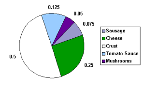
Example 2:
The pie chart below shows the ingredients used to make a sausage and mushroom pizza weighing 1.6 kg. This is the same chart as above, except that the labels no longer tell the fraction of the pizza made up by that ingredient, but the actual weight in kg of the ingredient used. To get the fraction of the pizza made up of any ingredient, divide the weight of the ingredient by the weight of the pizza. What fraction of the pizza does the sausage make up? We divide 0.12 kg by 1.6 kg, to get 0.075. This is the same value as in the pie chart in the previous 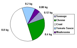
Example 3:
The pie chart below shows the ingredients used to make a sausage and mushroom pizza. The fraction of each element by weight shown in the pie chart below is now given as a percent. Again, we see that half of the pizza’s weight, 50%, comes from the crust. Note that the sum of the percent sizes of each slice is equal to 100%. Graphically, the same information is given, but the data labels are different. Always be aware of how any chart or graph is labeled.
| Use: |
Bar Graphs
Bar graphs consist of an axis and a series of labeled horizontal or vertical bars that show different
values for each bar. The numbers along a side of the bar graph are called the scale.
Example 1:
The bar chart below shows the weight in kilograms of some fruit sold one day by a local market. We can see that 52 kg of apples were sold, 40 kg of oranges were sold, and 8 kg of star fruit were sold. 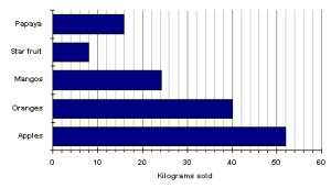
Example 2:
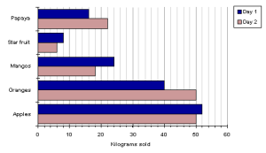
A double bar graph is similar to a regular bar graph but gives 2 pieces of information for each item on the vertical axis, rather than just 1. The bar chart below shows the weight in kilograms of some fruit sold on two different days by a local market. This lets us compare the sales of each fruit over 2 days, not just the sales of one fruit compared to another. We can see that the sales of star fruit and apples stayed nearly the same. The sales of oranges increased from day 1 to day 2 by 10 kilograms. The same amount of apples and oranges was sold on the second day.
| Uses: |
Leave a Reply
You must be logged in to post a comment.